
Zen Zoomies
When asked to make an adaptive website for a local shop, I knew that I had to design for pet retail. Unlike most retail workers, I actually enjoyed (and was even passionate about) my job and all it's various products. But I still wanted to make something unique and interesting.
Zen Zoomies, though a fictional business, explores the unique and captivating concept of renting enrichment toys for pets. With Millenials and Gen Z investing more money and time into their pets, a website catering to pet toy rentals presents an exciting market opportunity. Although Zen Zoomies (as a shop) is a fictional business, its logo and name come from my own pet behavior consulting business, which helped me feel a very personal connection to this project.
Project Overview
Project Type
Roles and Responsibilities
Date
Tools
An adaptive website
Project was a homework assignment with the prompt "design a website for a local business"
Sole UX designer
Research
Design
User testing
Wireframing and mockups
Prototyping
February 2023 to March 2023
Figma
Jamboard
Google Officespace
Wireframes
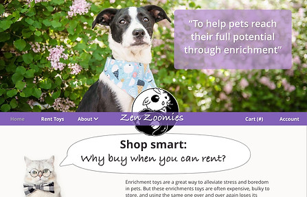
I wanted the homepage to be bright and simple. The first photos show the paper designs for the home page, where the final decision was to have a focus on a large hero image with the company’s mission statement on it, as well as a large, visible logo. You can see that design decision carrying through to the digital wireframe, and finally the mockup.


1

2


3

The key elements that I kept in mind throughout the wireframing process were:
1) for interactive elements (such as buttons and menus) to give users as much feedback as possible, and
2) to help users get through the checkout process quickly.
An example of these goals being demonstrated is on the toy browsing page seen below.
1) The navigation bar blocks helps users from clicking on buttons unnecessarily by showing the page that they are on as inactive.

2) Busy users familiar with the toys will want a way to quickly add toys to their cart, without having to go to each toy’s page
Screen size variations
After making a digital wireframe for computer screens for each page, I adapted each wireframe to fit a phone screen. The best demonstration of the adaptive design is in the toy PDP page. The phone’s layout aims to flow from the most important elements of the page to the least important, so that phone users do not have to scroll as far to get what they want.

1
3
4
5
2

1
2
3
4
5
Mockups
After prototyping and user testing, the wireframes were adjusted to fit users' needs. Again, I followed the idea that the design needed:
1) for interactive elements (such as buttons and menus) to give users as much feedback as possible, and
2) to help users get through the checkout process quickly.
Before

The "Add to cart" section was re-designed to give users more feedback. Not only does the new design help users were confirm that their item was added to the cart, but it also gives users the option of continuing their shopping experience as well as going back to the cart.
More users preferred the "Add to cart" to be higher up on the page, with the description of the toy further below for a faster checkout.
After


Another example is the "quick add" button, which was designed for users who may already be familiar with certain products and who know exactly what they want to check out faster. But it also is designed to give clear feedback to users by using iconography to tell users which items they've already added to their cart. They can also quickly remove the items the same way.
These two ideals were also kept in mind when making screen size variations, especially when designing smaller screens.
The navigation bar was turned into a flyout menu, with an additional cart icon available for users to check out faster.


The “Proceed to Checkout” was put at the top as a sticky button on the phone layout to allow users access to it without having to scroll, wherever they were on the page.


Again, the “Place Order” was put at the top as a sticky button on the phone layout to allow users access to it without having to scroll, wherever they were on the page.
Labelled numbers were placed at the top of of each page of the check-out to give users feedback on which step they were on.
Conclusion and Takeaway
The main learning curve with this project was how to use Adobe Xd. Some of the design choices in the website were made purely to get some practice in with Adobe Xd and all of its features (such as implementing scroll groups), and although there were some points of frustration with Adobe Xd’s limitations, I came out feeling very comfortable with the program. But, like with any beginner project, there are still changes that I would make.
For starters, I would want to finish the missing pages of the website- including the “About” pages, as well as an “Account” and "Settings", and a way to log in. Additionally, for the sake of time, some features were removed between prototypes, such as instructional videos for toys; these features could be added back in.
Of course, I would want to add more accessibility features, such as annotations for navigational devices and labels for screen readers, as well as a dark mode. I would allso want to include more sizes for the adaptability of the site. Currently there is just desktop and phone, but ideally I could also add a tablet size and test to make sure the desktop and phone versions work with different sized windows.